My first category is an Event, which includes pictures from different holidays I have been on. My favorite photo in this category is a photo I took in Germany. The main subject of this photo is a waterfall. I like this photo because it has good colour and textures. I took this photo for memories of the holiday. The photo follows the rule of thirds to get the attention on the main subject. Also the greenery around the waterfall makes the rocks and water stand out. The elements of this photo make it work because you can see different textures and colours, also i think that the lines in this photo make it work. You can see the different shades of green around the main image. Also you can see the shiny texture of the water on the rock and the sharpness of the water flowing down over the rocks. I think this photo could be improved by either taking it portrait instead of landscape or by taking it closer up. I have compared my photo to a 'professional' image and I think that my photo would look better if it had been taken portrait like the one I found on Google images.
 |
| This is my photo taken in Germany. |
 |
| This is a Professional image I got from Google Images. |
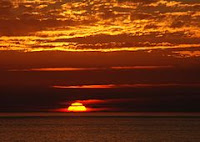
My second category is concept, this includes different scenes which include sunlight and shadows. My favorite photo in this category is one I took while I was walking my dog, of the sun setting over some trees. Also there is a few clouds in the sky which make it look affective. The photo's main focus is the sun and this picture makes it the main subject by the black silhouette of the trees. The colour is what makes this picture work, the orange and yellow sky with black looking trees. I think this photo could be improved by either cropping it so the sun is on the left side of the photo this to follow the rule of thirds. Or when taking the photo I could have considered the rule of thirds. I have compared my photo to a 'professional' image and I can see that by having the sun over the left side of the photo makes it more eye catching.
 |
| This is my photo. |
 |
| This is a Professional image I got from Google Images. |
 |
| This shows my improved image, with the rule of thirds. |
My third category is exhibition, which includes photos of structures in and around my area. The strongest photo in this category is a picture of Caldicot Castle. It shows the side of the castle leading to the tower. What makes this photo effective is the way the light is shinning onto the castle. The main subject of this photo is the tower, but it doesn't quite fit the rule of thirds. I took this photo because I am interested in the ruins and old structures in my area. The main element that makes this picture work is the clear lines. You can see in the bottom left hand corner the lines go to the main subject. Also it is a clear day where light and dark are playing with each other to make a good photo. The shadows play a big part in making this a good photo because you can see the way the light is shinning and where its reflecting on the castle its effective. I think this photo could be improved by making the tower into the rule of thirds.
 |
| This is my photo of Caldicot Castle |
I have compared my photo to a 'professional' photo and I can see that the light plays a big part in how the photo is effective. Also the professional photo I found is a good example of the rule of thirds.
 |
| This is a 'Professional Photo' |
Peoples views on my photos
Mr Page said my photos were very nice. Excellent contrast with dark tress and bright castle. His comment was on my photo of Caldicot Castle. I asked a member of my class about my photo I took off Caldicot Castle and he said he liked the way the photo was positioned because the light makes it look more affective. But he isn't interested in Castles so it wouldn't catch his eye. I also asked a member of the other class about my photo of the water fall and she said she loved the way the plants around the main image make the water fall stand out. Also she likes the way the light is on the main image and the plants are in the shade making the image eye catching. But she doesn't like the way I took the photo she thinks that it would look better if it was taken portrait rather than landscape. Amy looked at the picture I took of the sunset and said that the colours compliment each other, with the light on top and dark down the bottom. She thinks that it could be improved by making the main image into the rule of thirds.


